Wednesday 30 November 2016

Tuesday 29 November 2016


Friday 25 November 2016

Wednesday 23 November 2016

TA font research

1) 1
2) 1
3) 3
4) 3
5) 1
6) 0
7) 1
8) 2
9) 6
10) 1
11) 0
12) 1
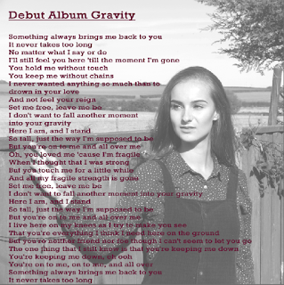
These are the results from our survey and number 9 got the mosts votes so we will use 9 for our company logo.
Tuesday 22 November 2016

Group post TA research (Instagram)


We used Instagram to form a TA research on what logo to use for our company.


There were 6 participants in this survey, all of which were girls (which could have affected the results).
We have decided to use the logo which got the most votes since it looks neat and professional.
Thursday 10 November 2016
Rough cut 1 - music video
We have just finished finished our first draft of our rough cut. We had a lot of problems such as the video was out of sync and we had some shots that did not work well without editing. It is still slightly out of time at some parts so we will sort this when we do our editing.
Monday 7 November 2016
TA research for music consumption results (part 1)
We carried out some TA research on 20 different people inside our TA age range to find out how they consume music.
Question 1: How do you consume music video's?
Music channels= 7
Youtube= 17
Social Media= 3
Other (please state what)= 1(Spotify)
Question 2: Do you listen to a lot of music?
Yes= 20
No= 0
Question 3: How do you mostly listen to the music?
Soundcloud= 2
Youtube= 7
Playtube= 3
Spotify= 7
Apple Music= 1
Itunes= 2
Radio= 1
CD= 2
Question 4: Do you ever download music? If so where from.
No= 5
Itunes= 6
Itube= 3
Apple Music= 1
Spotify= 3
Amazon Prime= 1
Youtube Converter= 1
Question 5: Do you ever buy CD's?
Yes= 5
No= 11
Rarely= 4
TA music consumption research (part 2)
Q1: We found out that most of our TA consume their music from Youtube as it is easily accessible for them to use and stream music. This was no surprise to me as Youtube is a free site where a modern generation can find music to play.
Q2: This gave us the knowledge that all of our TA like listening to music which again does not really surprise me.
Q3: From this we found out that Youtube and Spotify were the two most used apps that people use to listen to music. I feel that Youtube is not very surprising as it can be accessed through a range of different devices and the people do not have to pay for it. But Spotify is a different type of music app as you have to pay for it but it gives you all the up to date songs and does not require internet to use, which some modern day people cannot access when they are out and about.
Q4: In this question we discovered that most people like to download music from Itunes as it is an app that is automatically installed into all IOS devices and most modern day people use an IOS device over an Android. However there were few people who do not download music as I feel that this is because they have apps such as Youtube, Spotify and Amazon music to listen too music that is always there on their phone so there is no need to download it.
Q5: This question highly shocked me as from this we found out that 11 out of 20 people we asked don't buy CD's and some rarely buy them, which means that most of them use their MP3's and phones to listen too music. This is not good for our music video as we are turning our song into a CD so we will have to find a way of distributing it to our TA.
Friday 4 November 2016
6 worst photos

I liked this image because it shows our principal photography of our models having her make-up done. However I did not want to use this for my digipak and advert.
I did not like this image as she is not looking into camera and is not focusing.

I did not like this image as the quality is poor and it was not relevant to our video.

I did not like this image as the quality is poor so it was not useful to me
I did not like this image as she is not looking into camera.

These were taken when we were trying to take pictures when Sophie was not posing as sometimes these are more successful.
6 Best photos with posts on flickr

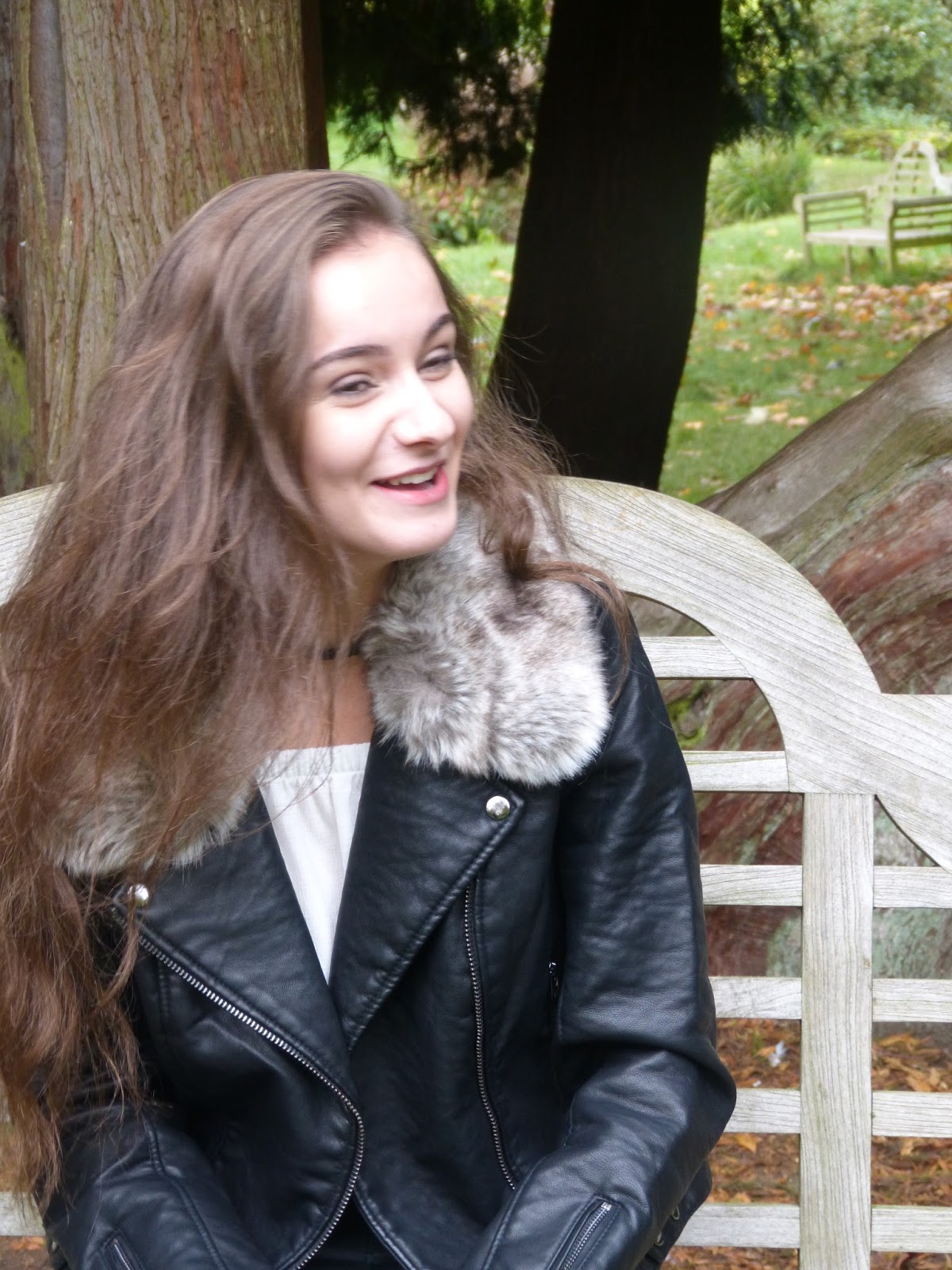
This is an image we captured when filming on the first day. I like this image as I thought it would be good for the back cover of my digipak as the models are center of frame so I thought we could place the songs list on the bed sheets.
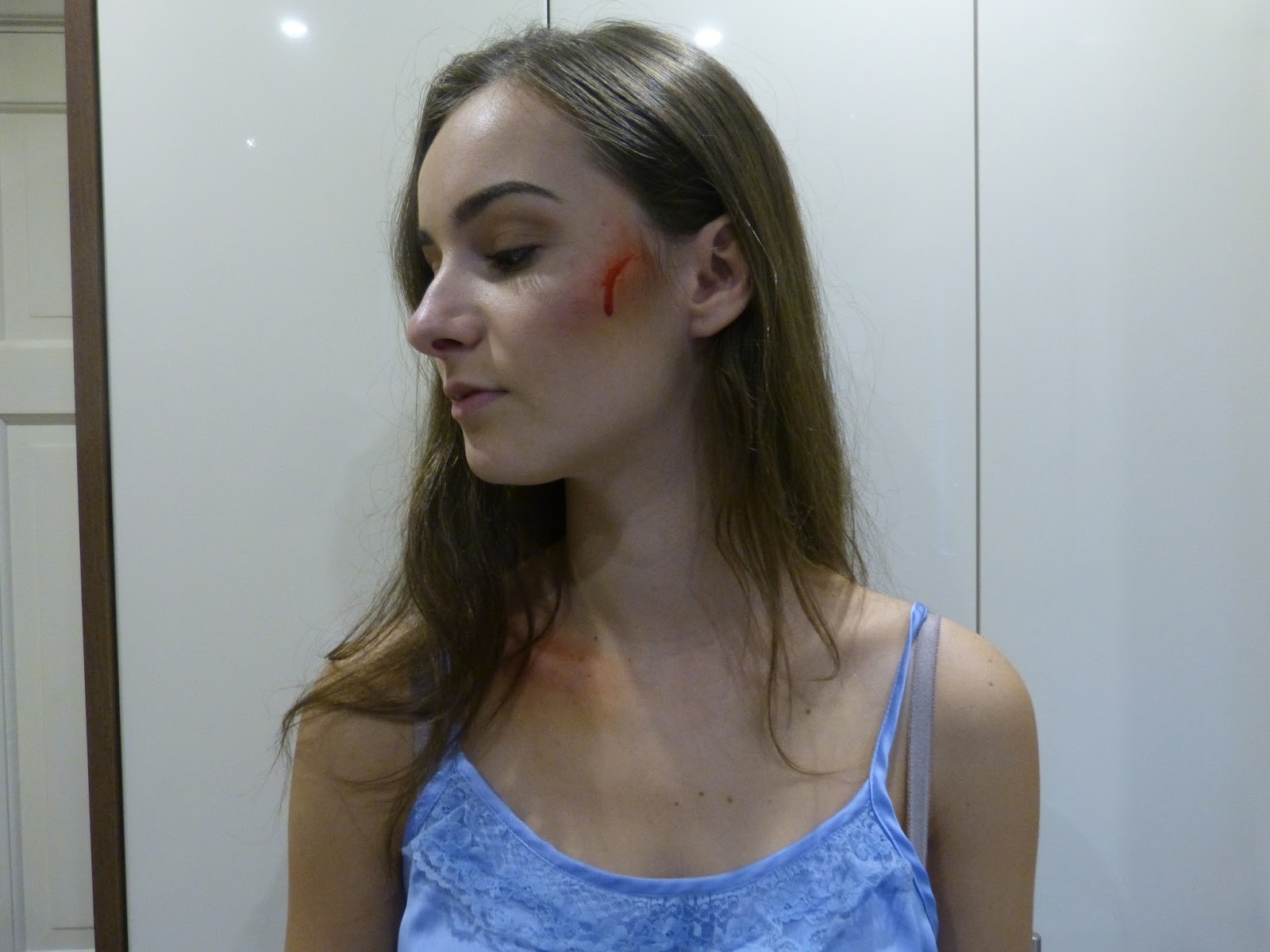
This was an image that we also took on the first day to show off the make up that we used to create the cuts on her face. I thought this image would be good for the inside page of the digipak cover. However I feel that it would not be suitable of conventional for the front cover of the digipak or for an advert as she is not looking into camera.

I think this image would be good for our digipak advert. Even though she is breaking conventions it could still work as some artists such as Ed Sheeran where he is not looking into camera.

This is my favorite of all the pictures as I feel this a very professional looking image as it is a close up of her face and creates synergy with the MV as it is the outfit that she is wearing in the MV. I feel that this would be good for the front cover of the digipak as she is creating direct address with the audience and adhering to conventions. I also feel this would work for an advert as this is something that Jessie J followed for her digipak and advert.

I feel that this image would be good for the inside cover of my didipak and I feel it is a great photo to use as her facial expression represents the mood of the video to show her unhappy side.

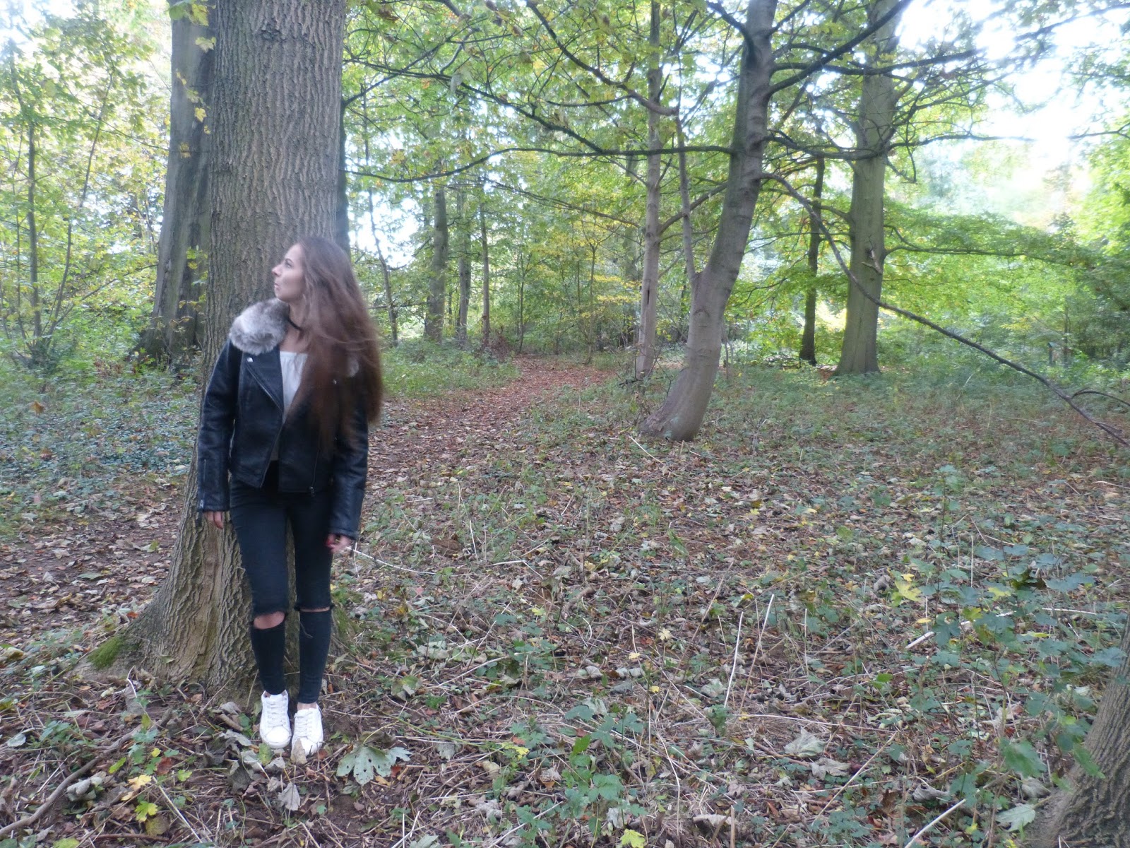
I thought this image would be good for my back cover of the digipak as it shows the softer side to the model and had lots of open space to add additional features.


We are considering using some of these for our digipak and album cover as they really show off the emotion of the artist and we feel will hook the audience. We felt these were the most effective pictures that we took and thought these would be the most appealing to our audience.
Thursday 3 November 2016
Research - Codes and conventions of digipaks/adverts

 This is a front and back cover of Jessie J's album. She follows conventions as she is looking directly into camera, which is a huge convention in digipaks as the star wants to hook the audience into buying it. This image has also been used for posters to advertise her tour dates, which creates synergy with the digipak. This supports the theory of Dyer 'A star is an image' as she has very dark make up to represent her as quite a powerful female. however there is gold used in her masthead, which could be used to give her quite a 'gangster' image as this works in cohesion with the font style.
The back cover is fairly simple as there is a lot of editing that has been put into the front cover to show off her image. It counteracts the front cover as the front cover is 'black dominated' and the back cover is just white with black text. I like this idea as it is kept fairly simple so the audience will understand what the song names are.

I like the idea of the inside of the cover being one big image as again it shows her with her eyes closed so her body and background is making the connection with the audience. They use the flowers to create synergy with her hair as she wants the colour to match. This image could represent purity and innocence as there are flowers used, but it could also represent attraction and power as the colours red and pink are used where she is laying in the flowers in a white dress, which could represent that she is turning from innocent to a powerful and love struck woman.
The use of flowers for the CD cover is something that I would like to use with my digipak as it works in cohesion with the background which is something that really appeals to me.

This is a digipak for Ellie Gouldings album. She follows conventions as she is looking into camera on the front cover. I like the idea of the name of the artist and the album being printed onto the CD itself as I feel that it creates synergy with the front cover. However I don't reall like the use of the white behind the text as I feel it makes it unclear. I like the idea of her on the back cover with the background blurred, as I can tell that this is one of her earlier albums so it wants to capture her and make sure she stands out to the audience. They have also dressed her in white to represent her as quite a pure person, which could be because she wants to bee seen as quite an innocent person as she is just starting of her career. However this digipak is strange as I think it seems to match more of a country music style than a pop one, as she is a pop artist.
Overall I will take in the research that I have found from these digipaks and use them when creating mine. I like a lot of ideas on these such as the CD cover working in cohesion with the background and her on the back cover next to the songs.
Subscribe to:
Posts (Atom)